viewport, window size and screen size in html
Today I read about an article about viewport, and made some notes.
In Desktop world
device pixels and css pixels
It turns out that, when we set css like width:100px, we are setting css pixels. When zoom is 100%, 1 css pixels equals 1 device pixel. But when we zoom in, we can see the elements is larger, that is 1 css pixel becomes larger than 1 device pixel, so that brower can contain less elements. The opposite appies for zoom out. So when we doing zoom, we actually change the actuall size of css pixels.
screen size
We can get screen size with screen.height, screen.width. They are invariant for the same device. In my mac air, it’s always 1366 * 768.
window size
Window size is how much space the browser has for display of elements. Obviously if we shrink or strech our brower, it will become larger or smaller accordingly. We can ge window size with window.innerHeight, window.innerHeight. This size includes the scrollbar width.
scrolling offset
This value indicates how much space have we scrolled. We can get the values with window.pageXOffset, window.pageYOffset.
viewport
A viewport constrains(wraps) the html element, it is as larget as brower window.
Its value can be obtained with document.documentElement.clientWidth
One important difference between window size and viewport is that, the viewport doesn`t include scrollbar. In my brower, the former will be about 17 pixels larger than the latter.
In mobile world
two viewports
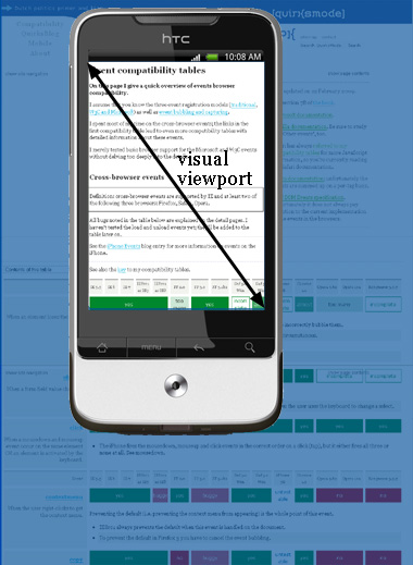
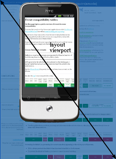
In mobile world, there are two viewports. One is visual viewport, which is the part of page which is currently shown on the screen, should be the same as device size. The other is layout viewport, which is the actual size of the page. Layout viewport can be obtained with document.documentElement.clientWidth, the same functions from viewport in desktop world. On mobile device, it is like we watch layout viewport through a window(visual viewport),
we move or zoom layout viewport, so that the part shown in the window is changed, and we can see differen parts of layout viewport. As shown below:
visual viewport is part of full page:
 .
.
layout viewport is whole page, only part of which can be seen:
 .
.
In recap, the visible part is the window in desktop world, while the whole part is the viewport in desktop world.
meta:viewport
In html we often see the line like this: <meta name="viewport" content="width=device-width, initial-scale=1">. What it`s done is setting the inital viewport to device-width, and scale to 1. As a result, when visited from mobile device, the page width will fit exactly to screen size.
media query
Here comes media query, which we often see in bootstrap, @media (max-width: 911px) { ... }. Based on MDN, the width width media feature describes the width of the rendering surface of the output device. The width of rendering surface is ambigous here. On desktop chrome or safari, the width is without scrollbar, which makes it equals to viewport. On firefox or IE, the width is with scrollbar.